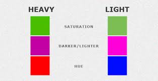
The ability of a region or element in a composition to draw attention often through contrast or color
Elements of a design or image have different degrees of ‘heaviness’ in relation to each other. By ensuring that key elements are ‘heaviest’, the viewer’s attention can be drawn to what is most important.
The visual weight can be obvious, such as when a large object looks heavier because it takes up more space than smaller ones. However, things get more complex when different colours and colour combinations are introduced. The contrast of the foreground and background, the changes in density and complexity, and varying levels of saturation also play their part in the relative ‘heaviness’ of each element.
By careully balancing all of these options, a visual hierarchy, symmetry, balance and harmony can be developed.

